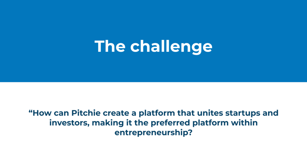
Project goal
The goal is to give Pitchie a new visual lift. That will give the users a better understanding of the product. Optimizing user experience of their platform and its features.
My role – Product designer
- Communicate with developers, Product Owners and users.
- Creating Prototypes and Mockups to test ideas
- Conduct user research and usability, implement insight to improve UX
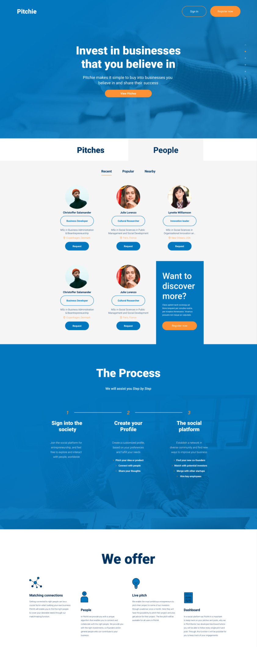
Pitchie ApS
- Pitchie is a SaaS company
- Social platform matching startups and investors
- Available on web and mobile
Visual branding
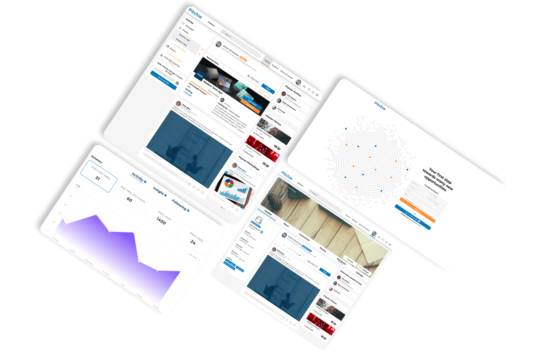
The platform really needed a makeover. The current design was all over the place, so we needed clearer guidelines and a better look.
Lots of things weren’t helping users navigate properly. My job was to spruce up the visuals and fix what was causing headaches for users. I ended up creating a whole new design-system in Figma, which made it easier to work together with the developers. Prototypes were key in figuring out what needed fixing. I gathered useful info through interviews and workshops, using usability tests and userflows.
![]()
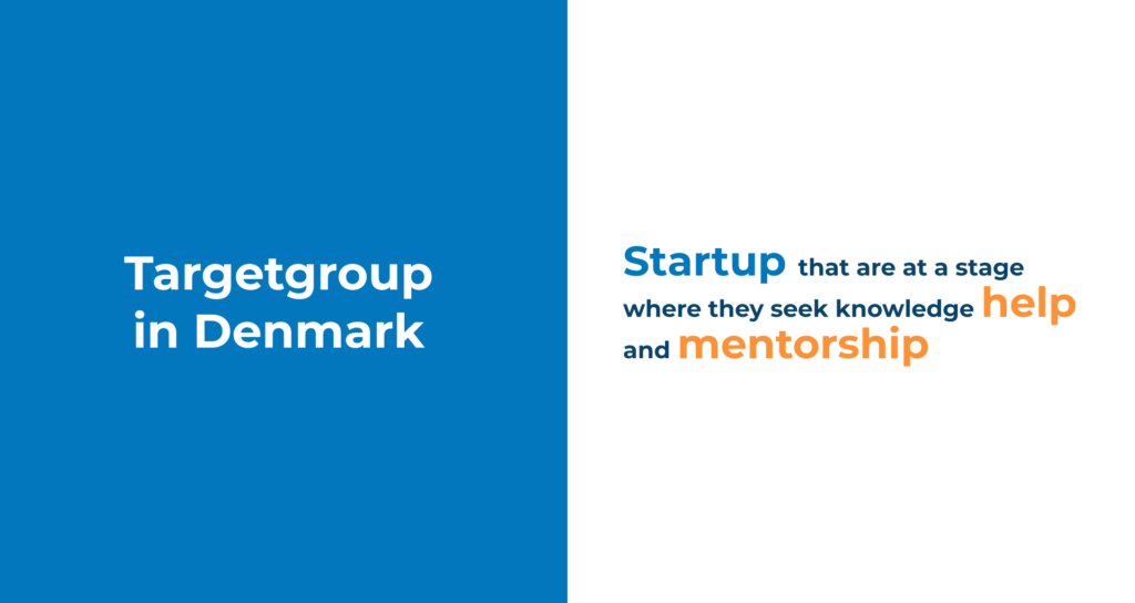
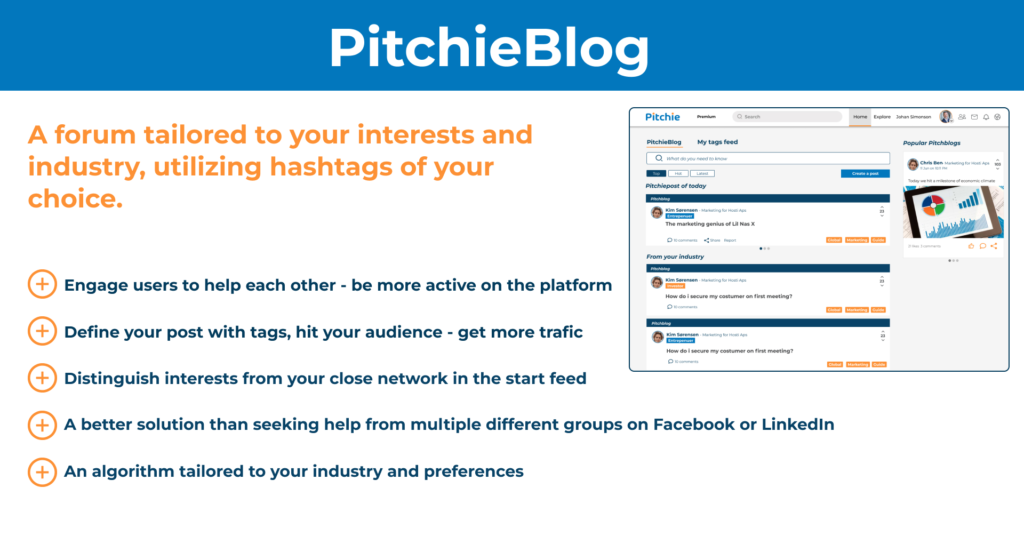
Creating a home for entrepreneurs
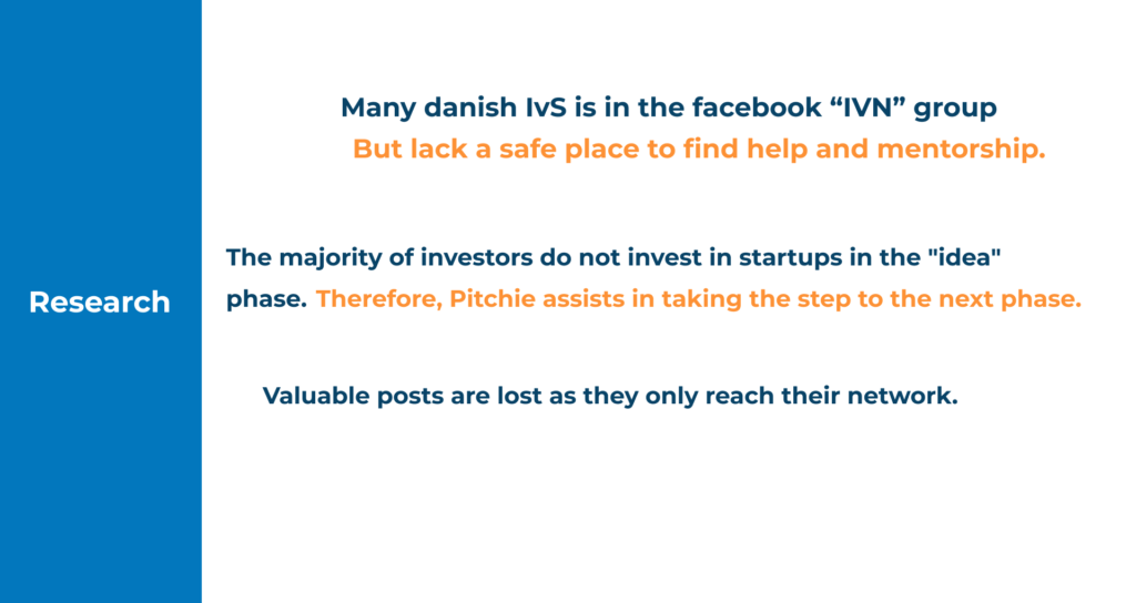
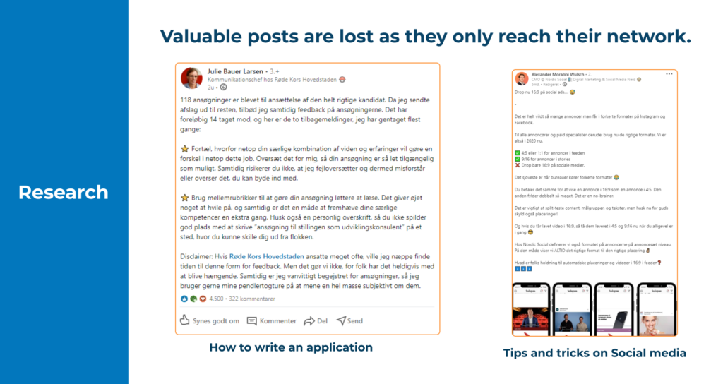
Our primary focus is on startups in Denmark. Our research delves deep into various platforms such as Facebook, LinkedIn, and other pitch matching websites. On Facebook, we identified large groups like IVN, which receive numerous daily posts. Among these, people frequently seek help and knowledge. However, we’ve observed that comments from some individuals are often arrogant, and there’s frustration with repetitive questions. Naturally, new members who join may receive a negative first impression, as Facebook groups aren’t tailored to accommodate every user’s needs.
The results:
The solution remains an ongoing agile process where we continue to refine the design and core features. Our primary objective is to establish Pitchie-blog as a highly trafficked destination for all entrepreneurs.
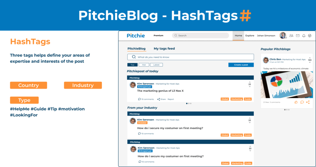
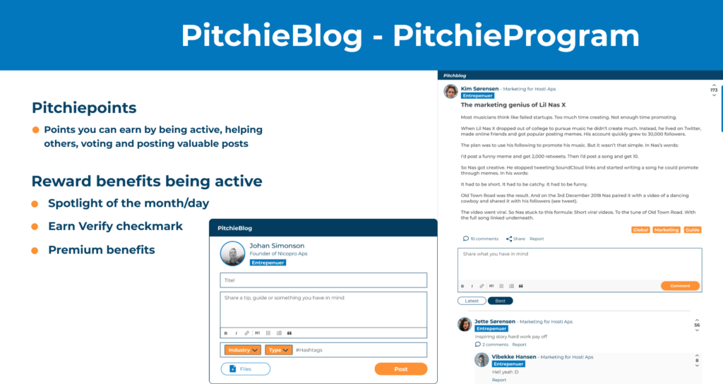
My concern is that if users don’t turn to a forum first, they may rely solely on their network for help. Implementing complex hashtags in every post and having users react with different tags could pose a challenge for the algorithm to function effectively. Additionally, one of the concerns is the points system, which may be susceptible to abuse. Therefore, clear guidelines and safe limits are necessary to prevent exploitation by bots.
I envision Pitchieblog a a huge feature that encourages active users to assist individuals to showcase themselves as influencers in their respective fields. This blog feature is currently in the pipeline and will be implemented once Pitchie has achieved greater stability in terms of traffic.
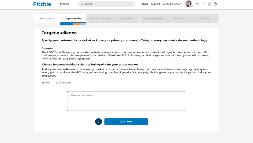
Pitch Creation
The old Pitch creation was confusing for users, so I simplified it. I organized the fields logically on sticky notes, highlighting important ones and understanding what’s less crucial for a roadmap.
Investors wanted more key info in the Pitch profile, like the user’s “target group” and what makes them stand out from competitors.
Entrepreneurs found it tough to fill all the Pitch fields, so I broke it down into simpler sections with examples. Testing the new pitch creation, users found it easy, but some couldn’t answer certain fields yet. So, I added a “save draft” feature at the end to avoid starting over if they leave by mistake, with a pop-up reminder.
Before and after

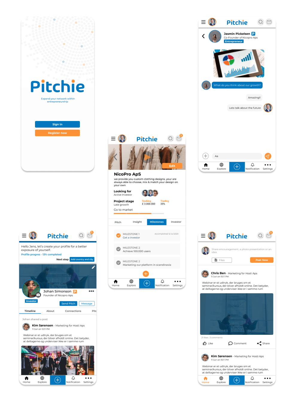
Pitchie App
My task involves creating intuitive and visually compelling user designs for their mobile applications. I focus on understanding user needs, designing seamless navigation, and ensuring a delightful user experience across different screen sizes and devices. My role includes wireframing, prototyping, and collaborating closely with developers to bring Pitchie’s concepts to life. I prioritize user-centric design principles to enhance usability, functionality, and overall aesthetic appeal in the dynamic and ever-evolving mobile landscape.